Here is my reflection on our genre conventions, target audience, techniques, and distribution practices.
AICE Media Studies Final Portfolio Project
Sunday, April 10, 2016
Saturday, April 9, 2016
Final Project
We've finally completed our film opening! We can't wait for you to watch it and we hope you enjoy!
Thursday, April 7, 2016
Fin!
Paty and I finished our film opening!!!!!! We truly can't believe what we've accomplished. I was nervous at the beginning of this project, especially when complications kept arising throughout the process, but it all worked out in the end and we're so proud of our work.
The main issue that we dealt with today was the wind in the background, but Paty, the GarageBand guru, fixed it as best as we could! We couldn't get it perfect, but we got rid of most of it. We also added the credits, which was simple.
It all come together so well, and we can't wait for you to watch it!!!
Wednesday, April 6, 2016
Editing!
We started piecing together our video clips and editing our film opening today!! We're including and layering all of the elements of sound that we wanted as well. We decided that all of our cuts will be jump cuts from scene to scene, keeping it smooth because otherwise the transitions will seem cheesy and amateur.
The lighting of different scenes wasn't continuous, and we want to make sure that we have continuity in our film, so we put a filter on almost every scene to make them all have the same colors and lighting to make sure it all flows together. We also layered the audio note of the screams and the eerie song to correspond perfectly with the scene of the blood splattering the window and the hand slowly falling.
Since we filmed outdoors, the opening scene has some wind that is a little too loud, so we're currently trying to figure out how to edit it out. Moreover, one of our scenes had to be edited to get the lighting right, which in turn made the image slightly grainy, so we also have to work on that.
We're almost done editing and plan to finish it all up tomorrow!!! We're so proud of what we've accomplished and can't believe we did it all on our own!
Finishing up!
The park at which Paty and I were planning to film was closed on Sunday for an 80s tribute concert, so we weren't able to film. Agh!! But alas, we got everyone together and we finished up filming!!!
We re-filmed our first scene and made it shorter to make sure we stay under the two minute mark, and it came out perfectly. There's a shooting range that's very close to where we were filming, and you could hear it on camera, but we had to film. We changed the dialogue in the opening scene to mention the gunshots so that it wasn't just extra sound. The boyfriend is discussing how he's going to miss the park, but not miss the gunshots, which then ties into how he's leaving his girlfriend for college (her motive for killing him and the rest of her friends).
We then had to do the murder scene with the blood splatter/bloody hand on the window, which was super messy.
We had a few trial runs with getting the right blood splatter, and figured out that the best way would be for Paty to flick blood onto the window, and then drag her hand down. It worked perfectly!
Filming in general went really smoothly! There were a lot of mosquitos eating us alive, but we dealt with it and got it all done.
We filmed everything first, and then did the audio of the murder scene last because it was the easiest and we didn't need any light for it. It all come out perfectly and we're going to edit it all today and are sooo excited to see the final product of our hard work!
We re-filmed our first scene and made it shorter to make sure we stay under the two minute mark, and it came out perfectly. There's a shooting range that's very close to where we were filming, and you could hear it on camera, but we had to film. We changed the dialogue in the opening scene to mention the gunshots so that it wasn't just extra sound. The boyfriend is discussing how he's going to miss the park, but not miss the gunshots, which then ties into how he's leaving his girlfriend for college (her motive for killing him and the rest of her friends).
We then had to do the murder scene with the blood splatter/bloody hand on the window, which was super messy.
 |
| We lined the car door with clear wrap and paper towels to prevent the fake blood from getting everywhere and staining the car. It worked really well! |
Filming in general went really smoothly! There were a lot of mosquitos eating us alive, but we dealt with it and got it all done.
We filmed everything first, and then did the audio of the murder scene last because it was the easiest and we didn't need any light for it. It all come out perfectly and we're going to edit it all today and are sooo excited to see the final product of our hard work!
Saturday, April 2, 2016
Sounds are scarier than sights
As we're filming and editing, we're realizing that we need to start thinking about sound. We're greatly inspired by the movie Scream because the opening starts calmly and gradually becomes more intense, until the music comes in and makes the audience uncomfortable while the scene gets extreme.
We plan to do something similar in that once the couple gets into the car, the eerie music starts playing. It'll start gradually, pick up with time, and end with a bang that's synced to when the victim's blood splatters on the car window.
I found this website that has a bunch of options for eerie sounds that are royalty free, so we don't have to worry about copyright, which makes our lives a whole lot easier.
We chose the sound "Welcome to HorrorLand" because it has that high pitched, unnerving sound we were looking for, and it starts off slowly and builds, which is perfect for the murder scene because it starts out as a couple making out and ends in the girl brutally murdering her boyfriend. The gradual growing intensity will add suspense and leave the audience wondering what's going to happen and when it's going to happen.
We want a sudden, climactic high-pitched sound that will synchronize with the shot of the blood hitting the window that will make the visual even more intense, but haven't yet found a sound that we see fits. We're going to continue looking, but we might just create the sound ourselves.
Friday, April 1, 2016
Graphic design time
Paty and I are on hold for filming because the next day that we can get everyone together is Sunday, so we decided to start working on our opening credits/title scene today.
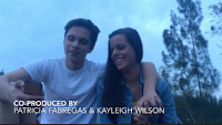
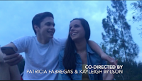
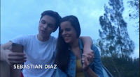
Most movies start out with the actors names showing up at the bottom of the screen, usually in order of importance, then naming the directors and producers, and the main credits listing everyone involved are shown at the end of the film. Because we're only filming a film opening, we're simply listing our actors' names with the murderer's name first because she's the most important character in the film, followed by our first victim's name. We then listed our names as co-directors and co-producers.


We decided to go with a simple font and placement so as not to distract from the scene.
With the title of the movie, Scream is a big inspiration of ours, so we decided to do something along the same lines as that opening title screen.
This title screen is simple, but gets the point across. We decided to make ours similar to that, so we chose a basic font and edited it to make the title gradually get larger, intensifying the name.
We're excited to continue filming and finally edit it all and have a final product!
Subscribe to:
Comments (Atom)


